No matter what opinion you hold of the look of Windows 10, there is no denying the fact that concept artists have really run wild imagining series after series of improvements to the OS.
This has been the story since before the modern platform made its debut with Windows 8.
And it continues, as these words are written.
Concepts imagining new Windows 10 features or improvements that have become public demand are nothing new, as we have seen in the past with support for tabs in File Explorer, and an overall dark mode for the OS.
Likewise, ideas that are inspired from rival platforms like macOS and Linux also make their way out regularly, envisioning features that have little chances to ever be adopted by Microsoft.
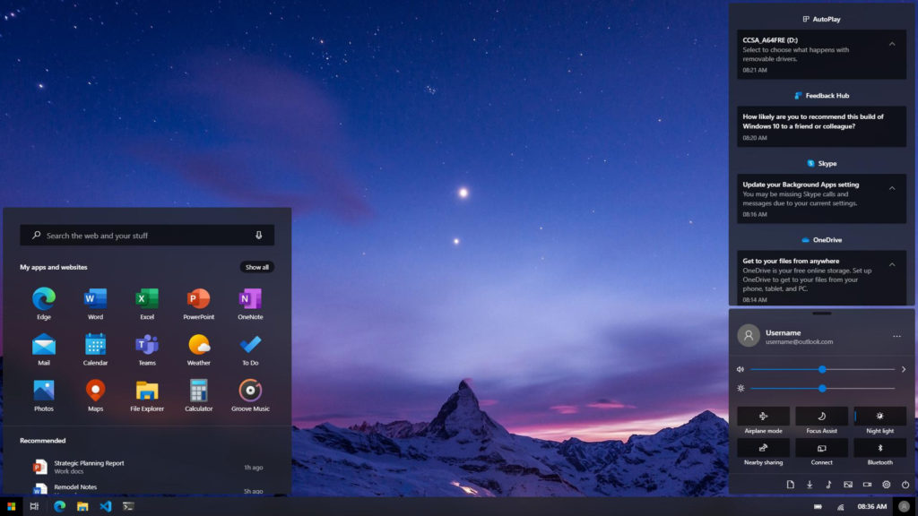
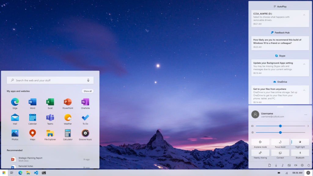
This new concept that we are highlighting today is made of the same cloth. It blends together design ideas borrowed from KDE and Windows 10X for an approach that not only looks stellar, but also makes a fair bit of sense.
Let’s take a look at it first:
As you can see, the Start menu is based on the one in Windows 10X, which is something that Microsoft seems to have chosen to go forward with. It is a simple and simplified affair that could well be the right way to do things in the long term for the platform.
Likewise, we also have a redesigned Action Center in this concept.
The bottom control center hosts quick access buttons, as well as sliders for volume and brightness. This comes at a time when Microsoft has removed the brightness slider from Windows 10, instead opting to go with fixed predefined values on devices to adjust the brightness of the displays.
Overall, this new concept also has a few touches of the KDE variant of Linux, to create what is overall a clean and modern design, both in light and modes.
Thoughts?
And should Microsoft borrow some ideas from it for Windows 10 version 2004, in your opinion?


All Comments
This looks very cool, actually…