
A new concept design has just surfaced, showing how the Action Center looks like when it draws too much inspiration from the macOS platform.
Surprisingly, it feels right at home on Windows 10, and fits the operating system just right.
Microsoft is yet to update the Action Center in its OS in a major way, but a major redesign for the notifications panel is expected to be introduced in the upcoming Windows 10X. Once there, the firm is expected to transition it to the mainline version of Windows.
But that is not stopping users from whipping up their own designs and concepts envisioning this corner of the operating system.
Anyway, let’s get straight to the design:
This concept is the work of another Redditor, who has drawn inspiration not just from macOS, but from recent touches from the Windows 10X user interface as well.
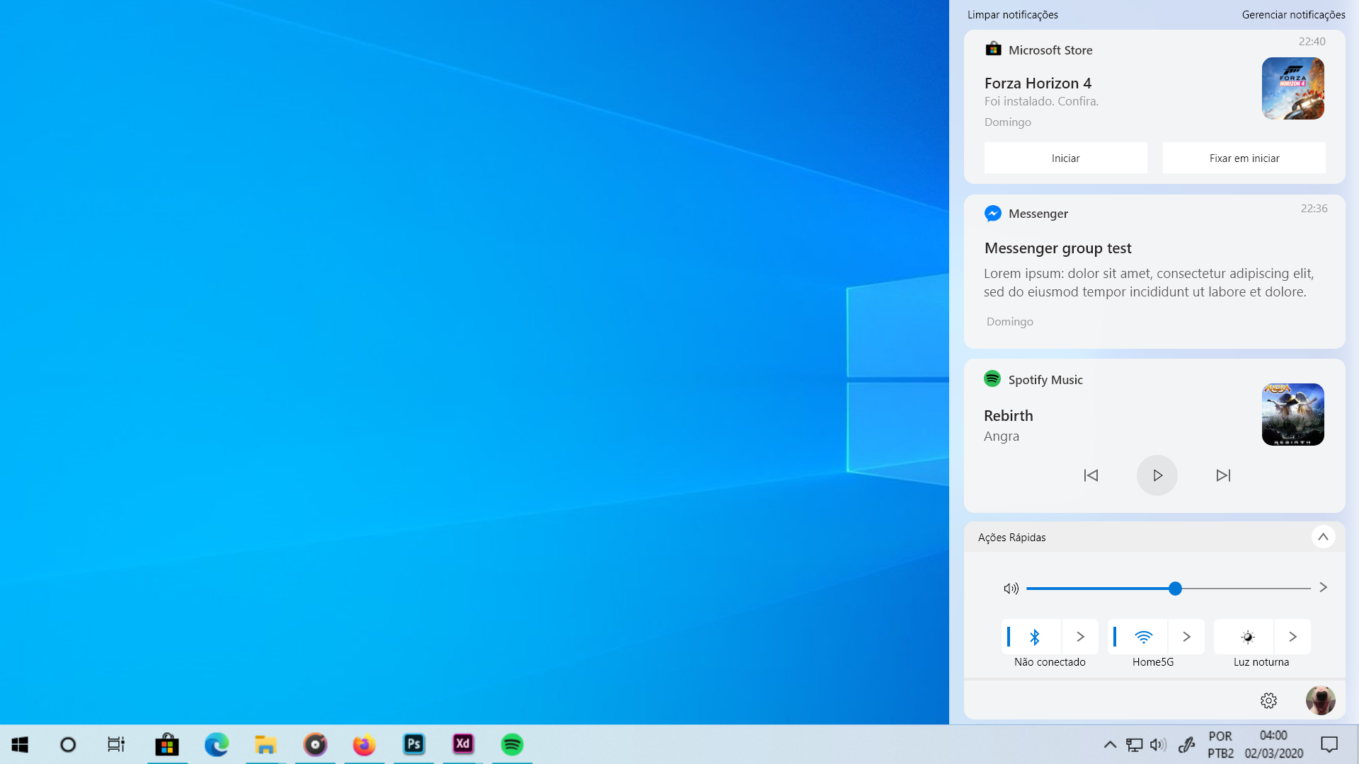
A particular highlight are the rounded corners, which is something that has been in the conversation lately. Recent evidence has suggested that Microsoft was pondering giving up the blocky Metro inspired look of the current UI, and go for rounded corners at some point in the future.
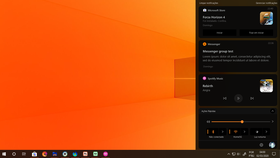
Someone even pitched a dark version by inverting the colors. It still looks spectacular, and seems to blend into the dark mode in Windows 10 quite seamlessly.
Remains to be seen just how closer the software titan moves to something like this.
But the arrival of Windows 10X, which is already turning heads duo the simplicity and style of its UI, there is a solid shot that Microsoft would give the full Windows 10 a facelift in the very near future.
In the immediate future, though, let us know how you think of such a direction. Are rounded corners the next logical evolution of the Windows 10 user interface?
Speak your heart out.


