The Windows 10 Live Tiles remain the most misunderstood features in the OS. And what makes the whole affair even more tragic is that Microsoft itself is the one that misunderstood them.
They were the defining feature of the modern Windows platform.
And with proper care and nurturing, could very well have become the most indispensable.
Of course, if we go by their name, Live Tiles, then it is common sense that these UI elements should have been much more than a simple way to launch apps and services. Yes, they are animated and beam information, but another layer of interactivity would have worked wonders for these.
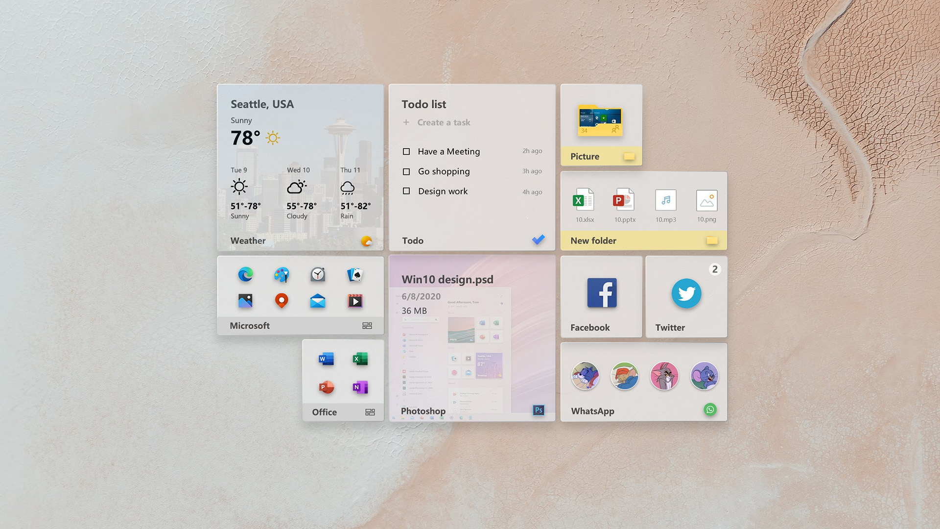
As shown in this concept by vGLAD on Twitter:
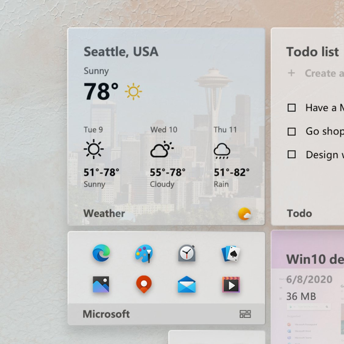
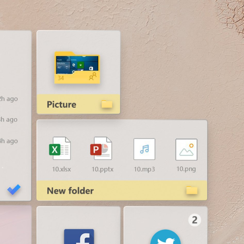
The design proposes a substantially refined look for these tiles, and takes hints from what the public has been demanding from Microsoft these past few years. And that is, interaction beyond just clicking on the tiles to launch applications.
For example, the To-Do live tile here allows you to check the tasks that have been completed, without the need to run the app to do the thing.
So on, and so forth.
Is this something that we could see Microsoft bring to Windows 10? Eventually? Don’t hold your breath!
While the dream of seeing interactive Live Tiles in the OS faded years ago, the fact that Redmond plans to keep them in hints that their story is far from over. Yet, at the same time, the company is more focused on creating theme-aware designs for these elements, rather than adding new features.
Oh well.


