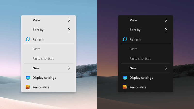
A new concept is here, aiming to fix the biggest problem in Windows 10. That of the inconsistency. It is something that Microsoft is finding hard to overhaul across the operating system.
The Fluent Design philosophy is what the company continues to refine and optimize.
But with the UI of the operating system being a blend of the traditional desktop experience with a modern side that relies on UWP applications, the Redmond based company is still nowhere near from creating a consistent approach.
And this shows even in the smallest of elements in the OS.
Just right-click on different places on the desktop, and you will see different context menu designs. And this disparity continues in different menus and apps in Windows 10. No wonder it has become one of the most criticized things in the operating system.
Fortunately, designers across the community are here to show us the possibilities.
This concept published by one of the finest designers in the world of Windows is proof that Microsoft can solve the whole thing with just a little effort. And that is, giving the menus in the operating system a touch of modern class.
Observe:
Envisioned here is a full package, one that not only includes modern icons for some of the listed options, but light and dark modes to align with the theme that is enabled in Windows 10. Furthermore, the spacing makes this context menu easy to use on devices that are capable of touch input.
More importantly, it makes full use of the Fluent Design system, and a user interface like this could be used across the whole OS.
Goes without saying that you should not hold your breath for Microsoft to pursue a revolution such as this any time soon. Otherwise, there would have been signs of it already.
Still, one can hope, eh?


