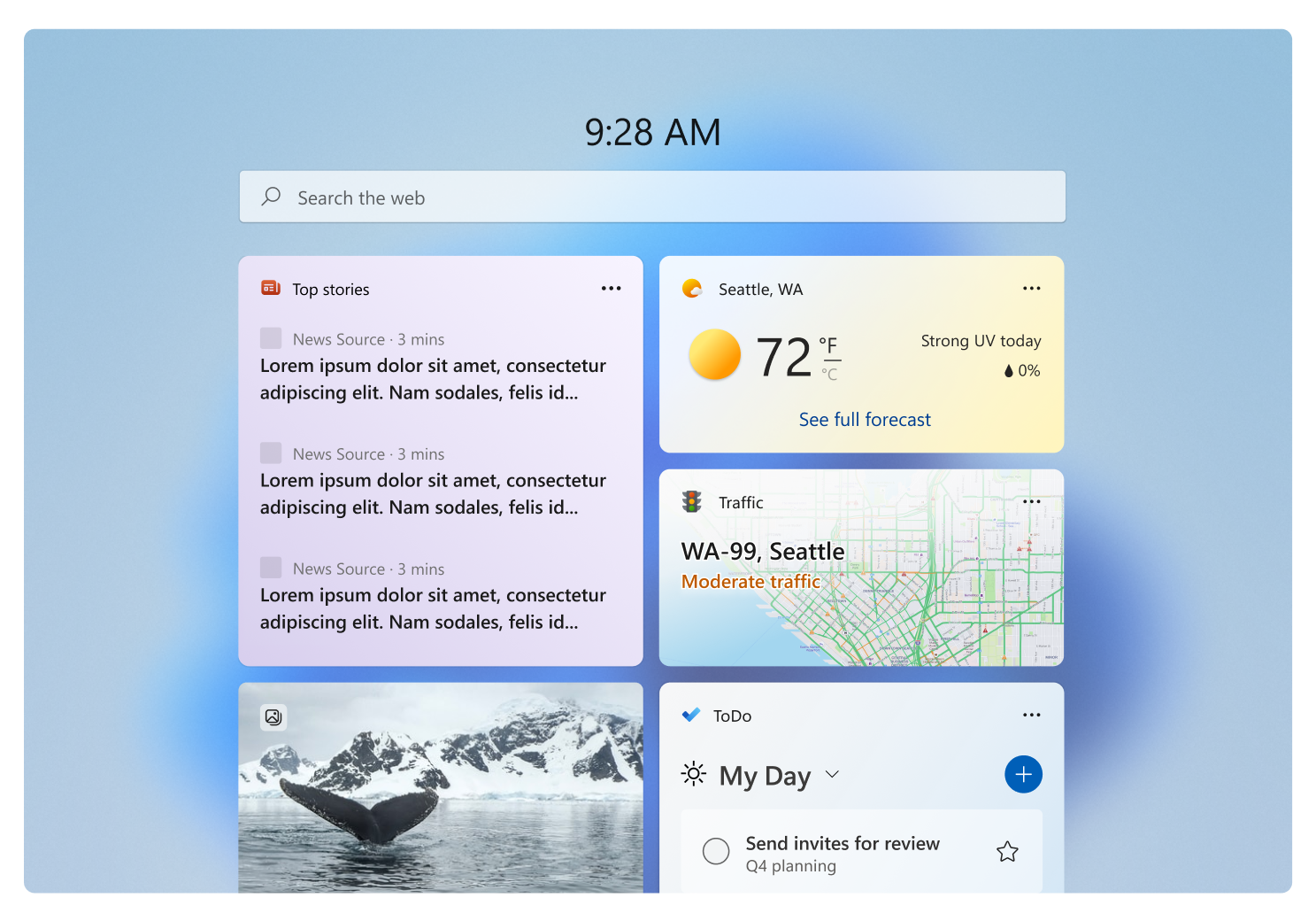
Depending on who is doing the talking, widgets are one of the best new additions in Windows 11. Technically, they are a return of the applets that were part of the operating systems prior.
Only, their current implementation in the OS is severely limited in terms of form and functionality.
Widget Widgets, what it is now, is simply a cluttered space that reminds us of tabloids.
But that might soon change, as Microsoft is finally ready to unleash third-party widgets. The company announced plans to let developers build their custom creations earlier this year, and the newest documentation published by Redmond shows that it is almost ready for showtime.
The Microsoft Learn website is playing host to a bunch of new articles recently put up that contain detailed descriptions of Windows Widgets, their components, UI elements, design guidelines, interaction manuals — you name it!
More importantly, the software titan describes the principles of good widgets that provide a satisfactory user experience. The main takeaways here for developers are that their widgets should be glanceable, dependable, useful, personal, focused, and fresh.
A handful of articles examine the development process in depth, discussing both the fundamentals and best practices for good design.
A very handy resource for developers, this is straight from the source.
Give it a read.


