While Microsoft is on a quest to modernize the Windows 10 user interface, the company’s approach is somewhat slow and is taking its sweet time to bring along the new improvements.
But that’s not stopping skilled designers out there in the community to come up with new ideas.
Faster.
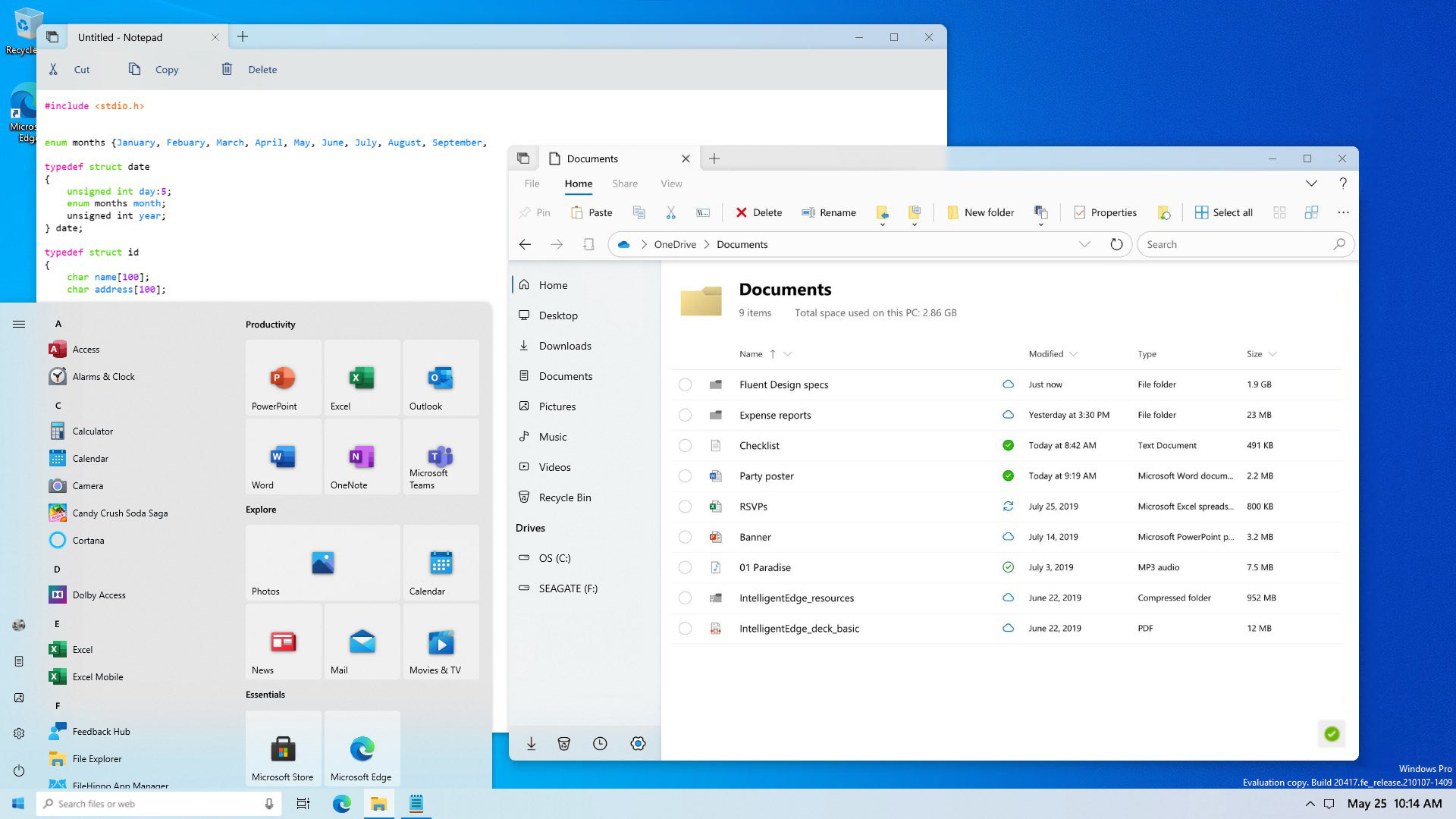
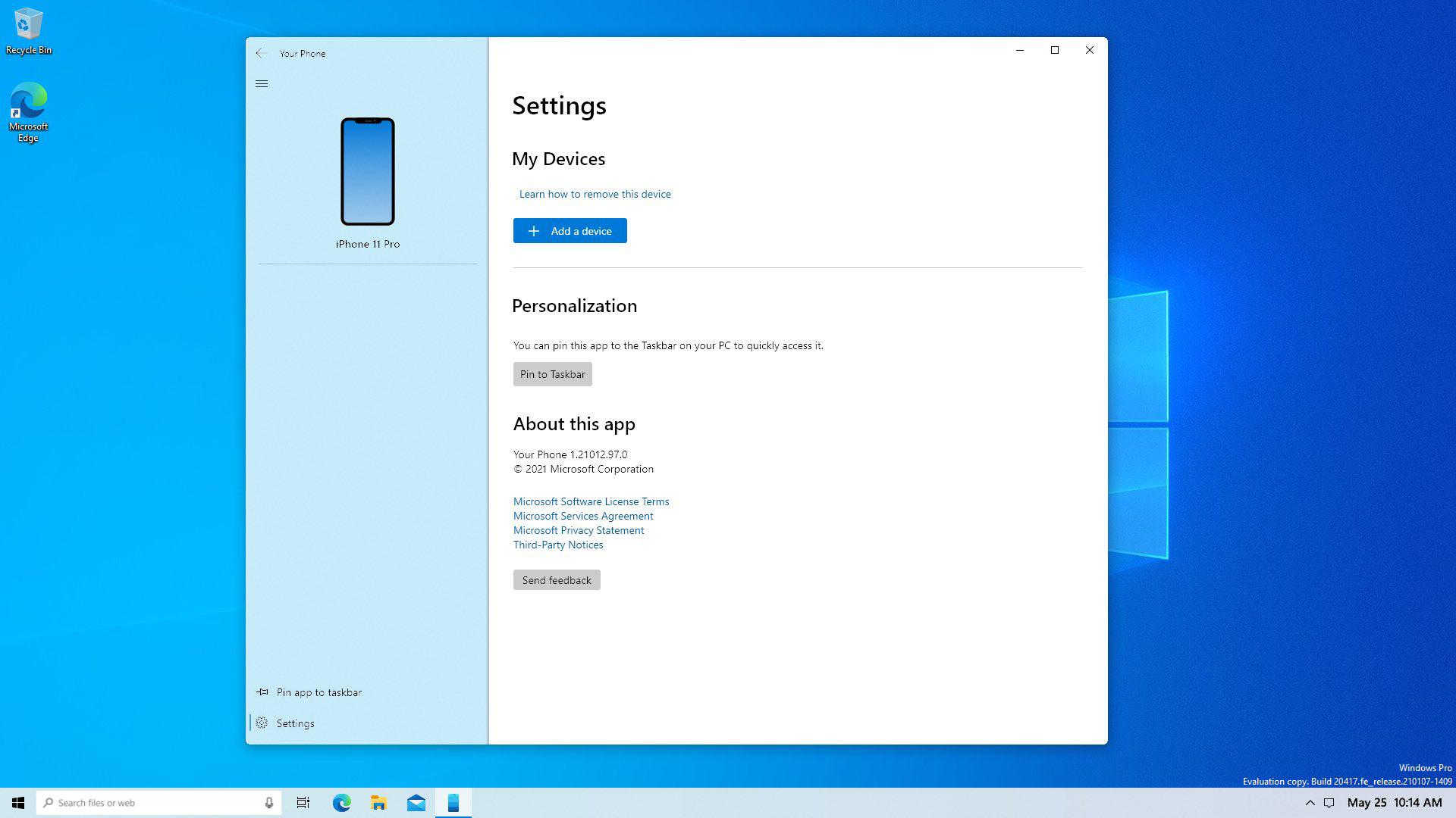
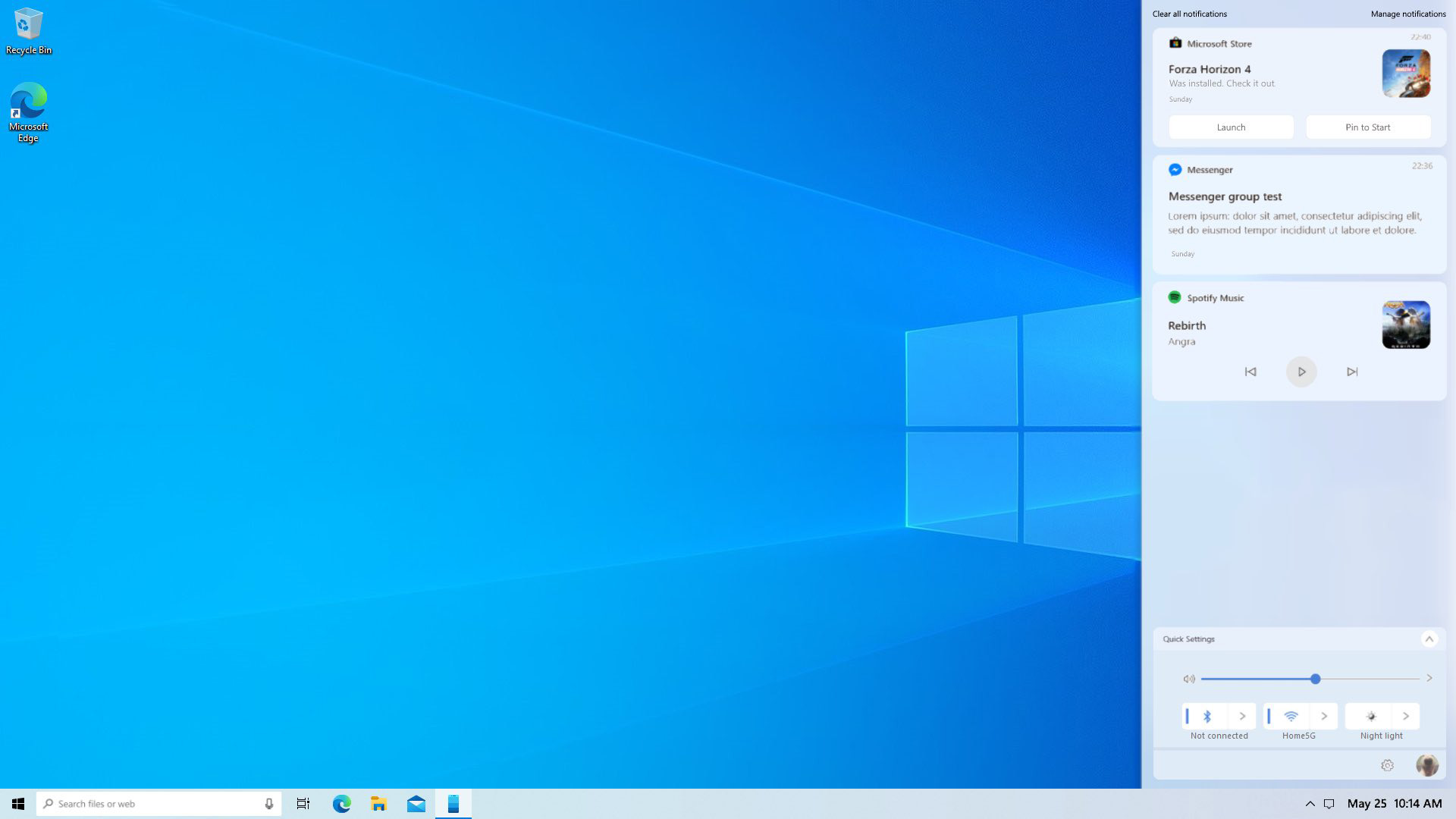
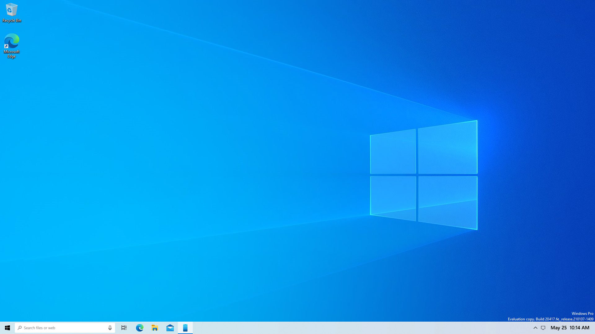
As is the case of this new concept that made its way out. It imagines Windows 10 with an evolution of the Fluent Design language, with several new touch ups that the users have been asking the software titan for quite some time.
Let’s take a look at it first before diving in:
While the main theme of this concept is inspired by other concepts that we have seen before, it also proposes several new additions.
The most prominent of which is a one-line date and time approach that fits in quite nicely. Makes on wonder why Microsoft does not offer this option for users in the first place, as it looks excellent if there is enough room on the taskbar.
Moving ahead, we have rounded corners across the desktop. There is a rounded taskbar search, rounded corners on tiles, windows, all over the Start Menu, and pretty much all other UI elements in the OS.
Now, this is something that Redmond has been experimenting lately, and there are voices that suggest Windows 10 might give up on sharp corners soon.
And finally, this clean and modern concept also brings back Sets, a feature that Microsoft has unceremoniously pulled. The dream of tabs in File Explorer, however, lives on in concepts like these.
How do you like it?


