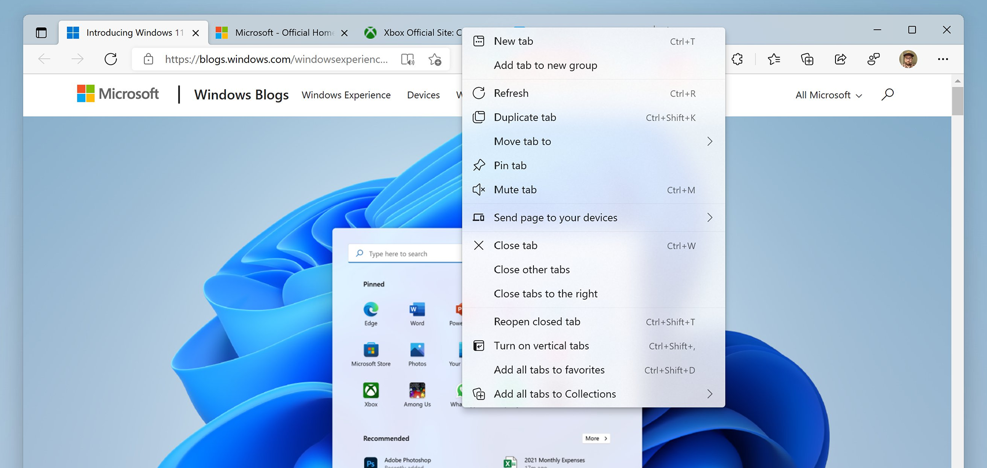
Microsoft is readying a visual upgrade for its Edge web browser. The company has shared a screenshot that hints at all the new UI enhancements in store for the program on the new OS.
In terms of features, the future looks stacked for Microsoft Edge.
But with the launch of Windows 11 looming large, Redmond is getting ready to give its fledgling browser a new look that is in line with the operating system. Though most of these user interface improvements will come to Windows 10 as well.
The software titan shared details about this new look in a tweet recently.
As you can see from the screenshot below, this redesign includes plenty of changes. We have refreshed the font size and positioning in context menus and the ellipsis option. Highlights when hovering on these items are now rounded off on the edges instead of spanning completely.
The title bar icons are also aligned in the middle, as is the norm with a lot of things in Windows 11.
Microsoft is also applying the Mica material that will enable translucent title bars in Edge, and the screenshot does a good job of showing it off. Overall, the UI looks very similar to what you might expect if you have been following the Fluent Design philosophy that Microsoft is pursuing.
Considering the fact that these updated elements are still being developed, it will be a while before they hit the different channels of the Edge preview program.
They should make it to the browser in time for the launch of Windows 11 later this year.


