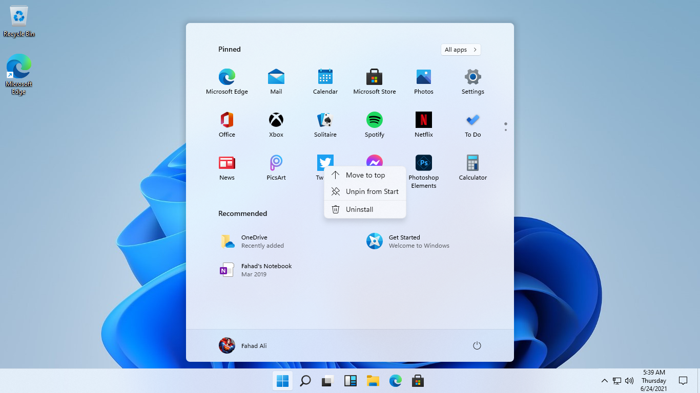
The star of the show! Like many of the mainstay features in the OS, the Start Menu is getting a revamp. In fact, it comes with a completely new look that goes hand in hand nicely with the other changes made to the Desktop.
If you are familiar with recent Microsoft projects, you probably figured it out already that the new Windows 11 Start Menu borrows its design from Windows 10X — an operating system believed to have been now ditched.
And as it turns out, Windows 11 is the OS that will now carry this new design further.
Let’s take a look at it:
There’s a lot to take in here, right?
Not only are the Start button and Taskbar now centered, the corners of the Start Menu are neatly rounded. Same goes for the icons and buttons that are now rounded rectangles. There is a new animation for popping the Start Menu in and out of the center dock, and some subtle shadows, too.
All these flourishes are very reminiscent of both macOS and Chrome OS. And even though a few of these elements have been in Windows in some capacity before, it’s very clear where Microsoft got this inspiration from.
This is still Windows at its core, just inspired by the competition.
Moving on from the looks, the concerning thing is that the Start Menu is missing current functionality. Live Tiles are, obviously, gone. But also missing are options like shortcuts to system folders, the ability to group icons into folders, going straight to app list, compact mode, turning off recommendations.
Even the ability to resize vertically and horizontally is unavailable in this leaked build.
So, all in all, there is quite a bit of code debt that Redmond will need to port over to this new Start Menu to prevent outcries from the community about the loss of form and functionality. This is, in addition to any further refinements it is planning.
But the good thing in all is that Microsoft has time on its hands.


